Taking the dismay out of display!
This week Esther sought advice from Richard Kennett about classroom display. What follows is their series of exchanged letters (well, emails!).
Richard is Specialist Leader for Education (History) and textbook author, Redland Green School, Bristol. He blogs at radicalhistory.co.uk
Dear Rich
I’ve been wracking the grey matter to try and overcome the seriously grey matter which is the empty display in my classroom. I want to engage the students in some way and saw you did a word-wall style display. Why did you do this and did it work?
Hi Esther
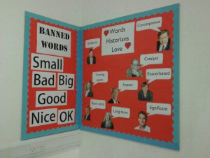
I assume you mean this one…
The main reason I did this is that I am trying to improve the sophistication of my kids’ writing. I teach a very able bunch of students yet their writing does not often reflect this. This display is one of my tools to tackle this.
I’ve been working closely with the English department in the last couple of years, as I am Literacy Lead for the whole school, and all of them use display actively rather than passively, putting up displays that students can engage with, have some utility and importantly get them to think. This is one of the displays in my room where I am trying to emulate my, far too talented, English colleagues.
One of the English teachers has a ‘Word Graveyard’ on her wall – words that are ‘dead’ to her – all displayed on little gravestones. I loved this idea and decided early in the year to nick it so that’s where the banned words come from. There is nothing wrong per se with ‘small’, ‘bad’, ‘good’ etc. but I want my students to do better. Secondly I’ve been having a real push with Year 11 to use strong analytical words in their conclusions, for example short and long term, and hence I came up with the idea for doing the opposite of the banned words – the words historians love. I wrote a short list myself and then asked my team for their suggestions and asked my followers on Twitter too. This produced a massive list that I whittled down to these.
It’s important to point out that I have no idea if the historians in the picture actually love these words! But it makes it look prettier and secondly has really helped with the idea that history is an active and dynamic subject as I’ve had a lot of chats in the last few weeks about who these historians are.
As for your second point about did it work, well, time will tell as it’s only been up a week. It has definitely generated debate and especially amongst my Year 8s I’ve heard a lot of conversations about “you can’t use THAT word!” which is superb. In a couple of lessons I have used it explicitly in my teacher instruction standing on the table in front of the display and talking through what the ‘words historians love’ mean. In these scenarios the students work did improve. Some used the words in a clunky, obvious way. But I’d rather they use these words, even in a clumsy way, than not at all.
Dear Rich
I love this! We’ve got word mats at my school but they suffer from not being out ALL of the time so they miss a trick – which your display cracks through its permanence. So it got me thinking: do you foresee having to create different displays based on what concept, skill or topic you are studying (eg specific language for talking about the nature of change)? This is a big question (for me) as I was also wondering about displaying student work and wouldn’t have enough room for both their work and different language. So what I guess I’m asking is which would you prioritise and why?
Hi Esther
Glad you liked it! I’ll deal with your two questions separately.
1. Which would I prioritise – displays about the process (like the one shown in the previous email) or displays of kids work?
The former – 100%. Displaying kids’ work is lovely but if I am being honest – a pain. You never have enough room to display everything which means you have to decide what to put up and what to leave off. In my NQT year this meant I always put the prettiest pieces up, but these were rarely the best pieces of history. The kids whose work is displayed always get a confidence boost, which is fab, but the majority of work doesn’t get put up due to space issues leading to annoying rants of “why didn’t you display mine sir?” Additionally, displays about work get tired very quickly and need constant updating. If you’ve stopped teaching WWI months ago and yet your display is on that it’s obvious to you and your students.
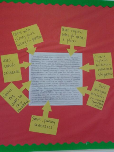
However, displaying work with comments can be useful to model what a great piece of history looks like. I did this in my old classroom by taking a photo of a really good Year 11 essay and enlarging it on a computer. I then added my comments, as I would in an exercise book. This worked really well and I really should do this more, especially in Post 16.
On the whole though, I feel that displays about the historical process are far more beneficial. Wall space in your classroom should be used to progress learning. I liked that in your Letter about marking you quoted Michael Maddison “a piece of work in history deserves a history comment”. Well I strongly believe a history classroom deserves a history display. In your lessons you plan to progress your students in history and I think that display space can be a tool to help you with this as you can hopefully see in the photos in this email.
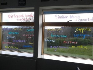
And it doesn’t just have to be display boards. Again nicking an idea from the English team, window-space is another surface to be utilized. Window pens cost a fiver for a pack and in Post-16 as a class we made a list of synonyms for ‘similar’ and ‘different’ to aid them with their source analysis question where they have to compare. This was a great tool for the entire summer.
2. Do you foresee having to create different displays based on what concept, skill or topic you are studying (eg specific language for talking about the nature of change)?
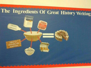
Put simply, no. I haven’t got the time to keep changing displays. In an ideal world what you are suggesting would be ace, but with my literacy job, SLE role, authoring and a million and one other things I can’t do it. As a result, rather than focus in on individual concepts I’ve kept things quite generic. This year I got a new classroom for the first time in years and starting with a blank slate I made this (sadly inspired by the Great British Bake Off at the time):
I designed it to be generic so that I wouldn’t need to change it again this year but useful enough that I can keep referring to it and the kids can to.
I think as a busy teacher (especially for you in NQT 2!) the key is designing something that can be used for a long period and have utility during this time.
In my own classroom, as a result of this, the other way I’ve used display is as a tool to inspire the students about history. I want my kids to love history and be as passionate and nerdy about it as I am. I’ve created a few displays that help do this. They were designed to be left for long periods of time and they have generated enthusiasm and questions. Here’s two examples:
Example 1: History Heroes
In Post-16 in the summer I got all my students to pick their historical hero and take a selfie holding an image of them (that’s me in the middle with my cat and famous cat lover Mark Twain). They loved this and in my Post-16 classroom these stretch round the room on a narrow board above all the windows.
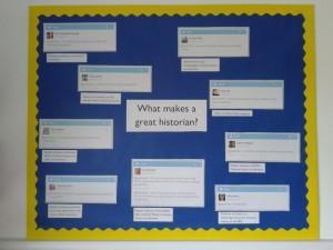
Example 2: What makes a great historian?
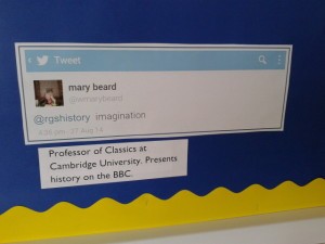
In the summer when I was bored I came up with an idea to tweet famous historians and ask them what makes a great historian. This wall is a list of those who responded including Tom Holland, Greg Jenner, Ian Mortimer and my personal favourite Mary Beard.(NOTE: This photo is awful – sorry!)
I hope all of this was useful and I look forward to seeing some of your photos of your displays in future!
Rich
P.S. Apologies for the dreadful photos my mobile camera isn’t great.
Dear Rich
Wow. This is such a rich reply (no pun intended). I’m dissecting, ruminating and cogitating; to say my grey matter is whirring is to put it mildly. On a simple NQT2 level of worrying about time I’m so relieved to hear you say you won’t be changing the displays all of the time. Another instant reaction to your letters is HOW COOL is the window idea!? My classroom has 4 square windows and that will be such a brilliant way to use these spaces (not least because I don’t deny that some of my students will often gaze out of them – yep my teaching can leave a lot to be desired!). And I love all of your ideas, especially the historical hero selfies. I’m going to reply at length soon so this is just a quick reply to say …
THANK YOU, WOW and YAY – I’m inspired.
Esther

